Conveying the essence of the Institute of Engineering at Suranaree University of Technology, comprising 17 schools united in their commitment to nurturing skilled individuals and advancing engineering knowledge in the nation, in alignment with the institute’s vision and mission.
สื่อความหมายถึง สำนักวิชาวิศวกรรมศาสตร์แห่งมหาวิทยาลัยเทคโนโลยีสุรนารี ซึ่งประกอบไปด้วย 17 สาขาวิชา (ส่วนงาน) ที่ร่วมแรงร่วมใจกันสร้างกำลังคนและความรู้ด้านวิศวกรรมศาสตร์ของประเทศตามวิสัยทัศน์และพันธกิจของสำนักวิชาวิศวกรรมศาสตร์
Conveying the significance of the Institute of Engineering as a driving force behind the sustainable growth of Suranaree University of Technology.
สื่อความหมายถึง การที่สำนักวิชาวิศวกรรมศาสตร์เป็นกำลังสำคัญในการขับเคลื่อนการเติบโตอย่างยั่งยืนให้แก่มหาวิทยาลัยเทคโนโลยีสุรนารี
Crimson is the blood colour of Vishvakarma, the deity of engineering and craftsmanship. The Institute of Engineering has designated Burgundy, a darker shade of Crimson, as the primary identity colour, symbolising wealth, power, elegance, ambition, creativity, relaxation, and stability.
สีแดงเลือดหมู เป็นสีโลหิตของพระวิษณุกรรม ซึ่งเป็นเทพแห่งวิศวกรรมและเทพแห่งการช่างทั้งปวง โดยสำนักวิชาวิศวกรรมศาสตร์ได้กำหนดให้สีองุ่นแดงเบอร์กันดี ซึ่งเป็นเฉดสีเข้มของสีแดงเลือดหมูและเป็นสีที่สื่อความหมายถึง ความมั่งคั่ง อำนาจ ความสง่างาม ความทะเยอทะยาน ความคิดสร้างสรรค์ การผ่อนคลาย และ ความมั่นคง เป็นสีอัตลักษณ์หลักประจำสำนักวิชาวิศวกรรมศาสตร์แห่งมหาวิทยาลัยเทคโนโลยีสุรนารี
The Institute of Engineering uses the Suranaree University of Technology’s identity colours, which consist of Orange, Gold, Grey, and Black, as the secondary identity colours for the Institute of Engineering.
สำนักวิชาวิศวกรรมศาสตร์ใช้สีอัตลักษณ์ของมหาวิทยาลัยเทคโนโลยีสุรนารี ซึ่งประกอบด้วย สีแสด สีทอง สีเทา และสีดำ เป็นสีอัตลักษณ์รองประจำสำนักวิชาวิศวกรรมศาสตร์
The Institute of Engineering additionally uses White as the natural colour to balance out the design as required.
สำนักวิชาวิศวกรรมศาสตร์ใช้สีขาวเป็นสีกลางเพื่อปรับสมดุลของการออกแบบตามความเหมาะสม
CMYK: 0 100 75 50
RGB: 128 0 32
HEX: #800020
CMYK: 0 100 75 50
RGB: 128 0 32
HEX: #800020
CMYK: 0 75 100 0
RGB: 242 101 34
HEX: #F26522
CMYK: 40 60 100 0
RGB: 166 116 54
HEX: #A67436
CMYK: 0 0 0 0
RGB: 255 255 255
HEX: #FFFFFF
CMYK: 0 0 0 70
RGB: 109 110 112
HEX: #6D6E70
CMYK: 0 0 0 100
RGB: 0 0 0
HEX: #000000
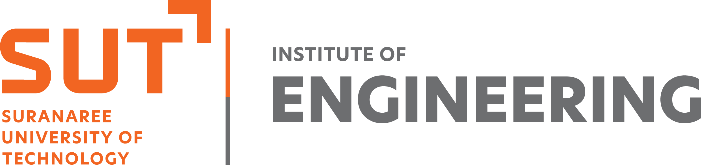
The Suranaree University of Technology has designed a lettermark to support the creation of a widely recognised SUT brand. Its role focuses on use in media and general public relations materials, prioritising visual clarity and flexibility for usage on modern media platforms. In addition, Suranaree University of Technology has designed a lettermark for the Institute of Engineering as its sub-brand, featuring both English and Thai versions of the Institute’s name.
มหาวิทยาลัยเทคโนโลยีสุรนารีได้ออกแบบตราสัญลักษณ์ตัวอักษรขึ้น เพื่อสนับสนุนการสร้างแบรนด์ SUT ให้เป็นที่รู้จักในวงกว้าง โดยวางบทบาทเน้นการใช้งานบนสื่อและชิ้นงานประชาสัมพันธ์ทั่วไป จึงให้ความสำคัญกับประสิทธิภาพความชัดเจนในการมองเห็น รวมถึงมีความยืดหยุ่นในการใช้งานบนสื่อในยุคปัจจุบัน นอกจากนี้ มหาวิทยาลัยเทคโนโลยีสุรนารียังได้ออกแบบตราสัญลักษณ์ตัวอักษรให้แก่สำนักวิชาวิศวกรรมศาสตร์ ซึ่งเป็นแบรนด์รอง โดยมีทั้งชื่อสำนักวิชาวิศวกรรมศาสตร์ที่เป็นตัวอักษรภาษาอังกฤษและตัวอักษรภาษาไทยอีกด้วย


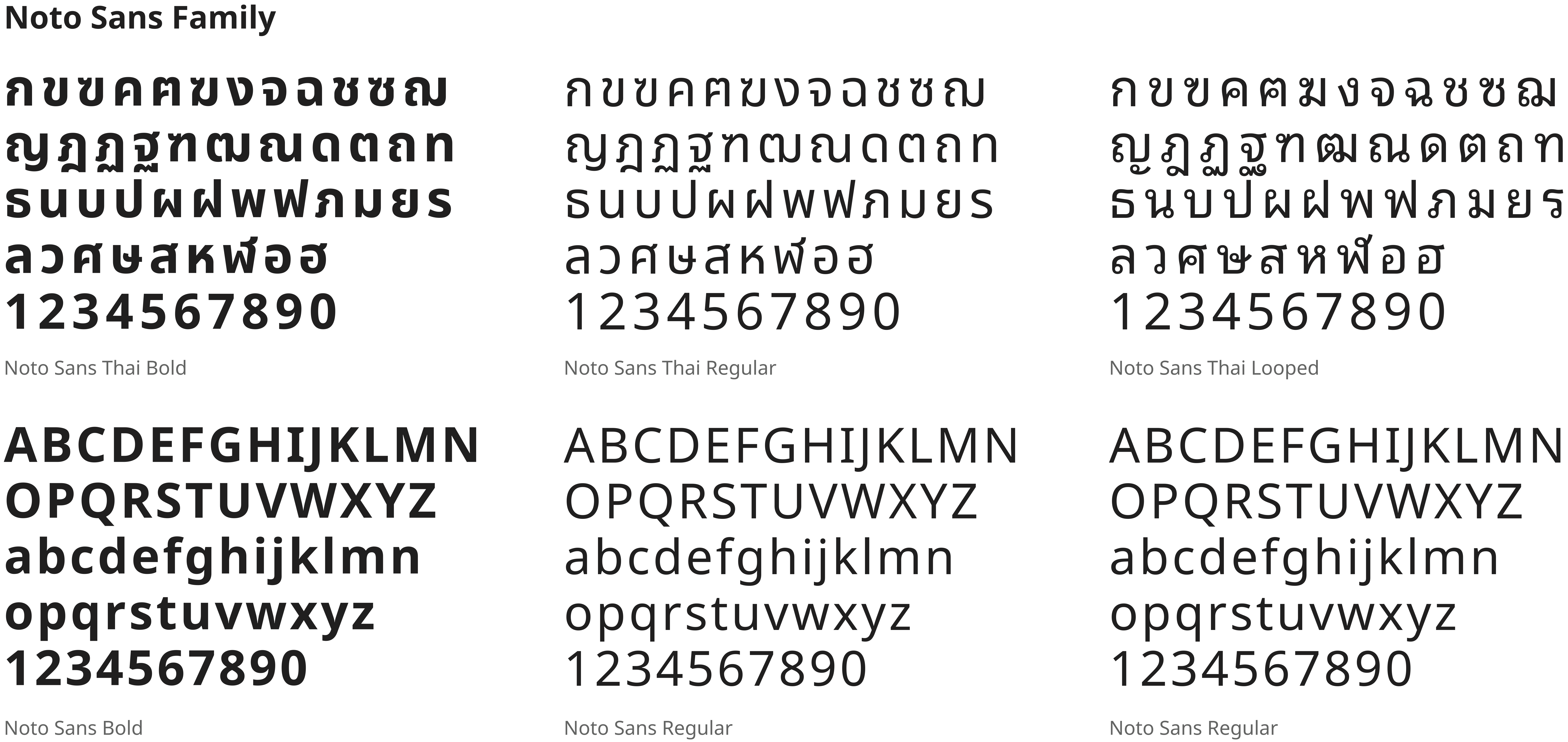
Suranaree University of Technology has designated the Noto Sans Family as the official typeface for use in promotional materials. The Medium or Bold weights are recommended for headlines and subheads, while the Regular, Light, or Noto Sans Thai Looped weights are recommended for body text.
มหาวิทยาลัยเทคโนโลยีสุรนารีได้กำหนดให้ Noto Sans Family เป็นชุดตัวอักษรอัตลักษณ์ในการออกแบบสื่อประชาสัมพันธ์ โดยแนะนำให้ใช้ความหนาระดับ Medium หรือระดับ Bold สำหรับส่วนหัวเรื่องและหัวเรื่องรอง และแนะนำให้ใช้ความหนาระดับ Regular ระดับ Light หรือ Noto Sans Thai Looped สำหรับเนื้อหา